"Good design is an investment, but it should also be an imperative. Building your website to ensure that it is fully accessible to all users may take a little extra time and attention, but it really should be the minimum requirement."
Established in 1987 and based in Belfast, Ark Housing Association provides social and affordable homes for those in housing need across Northern Ireland. Ark’s old website was launched more than ten years previously, but replacing it never quite became the top priority for the organisation. Then the Covid lockdowns of 2020/21 suddenly saw the website thrust to the forefront of the operation as the key means of communicating with tenants. It quickly became clear at this time that tenants found the website difficult to use and to navigate and that it was fiddly for staff to update and operate. In addition, as the world began to slowly return to normal, Ark experienced an exceptional period of growth as they sought to increase its contribution to social and affordable house provision by building more new homes. The time now seemed right to work on a new website and to perhaps also add a tenant portal to the offering. So, in January 2022, Ark issued an invitation to tender to redesign the existing website.
Housing Online were well-placed to respond to this tender. With a long track record of exceptional website delivery for housing associations, Housing Online were also uniquely placed to offer both design expertise alongside the proven ability to provide a fully integrated tenant portal and mobile working solution in the shape of My Home.
Here’s Laura O’Dowd, Director of Housing at Ark:
"We were looking for a company who would work with us to make our new website fresh, user friendly and up to date. Housing Online applied for this tender and as part of their proposal, provided us with examples of their previous work which we were very impressed with. The added bonus was that they were also able to design our new tenant portal alongside the new website."
After a successful tender, Housing Online quickly set about the business of working with Ark to get to the bottom of the requirement by seeking to understand the issues with the existing Ark website and their aspirations for the new site. Steve Jobs once said that “Design is not just what it looks like. Design is how it works”, and, at Housing Online, we are big believers in the value of a mindful design. A tenant on the website might not realise the value of this care as they use the website, but they should experience it with every click they make and every page they browse. At the start of a project like this, Leanda, our Design Director will always take the time to work with the customer considering the finer details that will make such a big difference to the usability of the end product for both staff and for tenants.
Ark wanted the new website to be modern, but friendly, to reflect them as an organisation. It should be attractive, easy to access and easy to use. The Ark logo features five corporate colours, and the idea was that the rest of the site should align with those colours, focusing on the logo as the cornerstone of the site.
Here’s Laura again:
" The Housing Online’s team’s expertise and passion for what they do shone through and we found Leanda’s vision and creativity a breath of fresh air. The team were patient and professional, even with our ever-changing requirements and were always at the end of the line to provide us with constructive design guidance if we ever veered off track and they always ensured that the website remained accessible and user friendly with any changes we made."
Leanda’s design work is detailed but worth considering in brief here to show how we approach a project like this:
Typography: the Ark logo had a mix of three typefaces and we chose a new typeface family and reduced the overall number of typefaces whilst still retaining the look of the original logo. Poppins was chosen as it had a strong and sturdy appearance, but also a very open and playful feel. It has a circular design making it a great compliment to Ark's circular logo shape. The spacing of all the logo elements were rebalanced and adjusted to accommodate the new typeface.
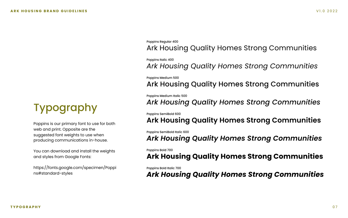
Colour: The existing branding colour swatches were tweaked to make them more vibrant and throughout the design process, the colours were checked for any accessibility issues.
Logo and branding: We produced a Logo and Branding Pack for Ark, containing the new logo files in various formats and a ReadMe file detailing when best to use each logo. The pack also contained a short brand guidelines document. This document detailed the use of the logo, typography, brand colours and a few other bits and pieces. This is shared internally to ensure that brand consistency is maintained.
Wireframes: We started the website design with wireframes. Wireframes are helpful because they provide a visual representation of the website's layout and functionality without the distraction of typography, colours, images, and other design elements. This allowed Ark to focus on the structure and content of the website, and provide feedback on the overall user experience.
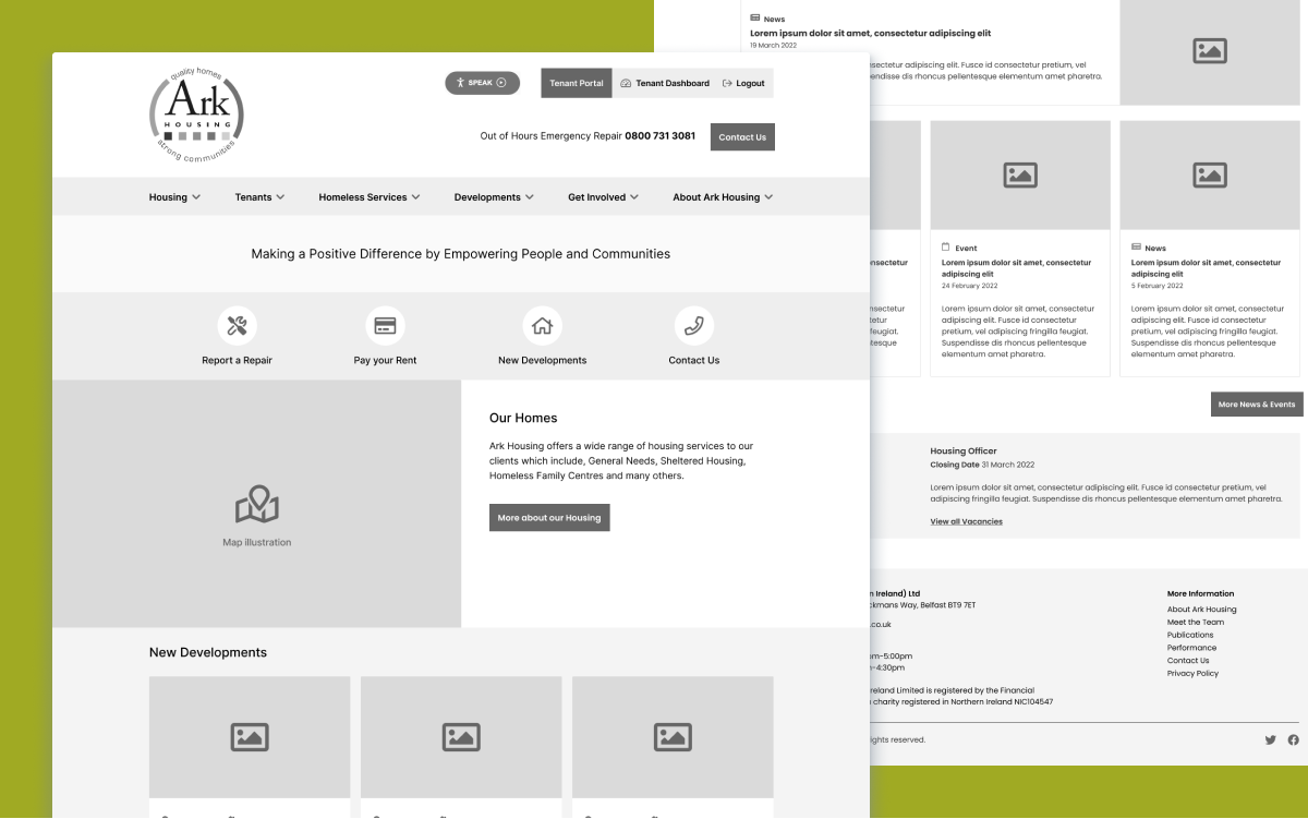
Site Design: From wireframing, we move onto the site design process. We applied the visual branding, using the colour swatches, typography and the newly aligned logo. We also took Arc shapes from the logo as backgrounds to add depth and texture to the design and tie the overall design in with the logo. Everything is designed for mobile first to ensure a better user experience for the growing number of mobile users (who now make up a significant proportion of website users).
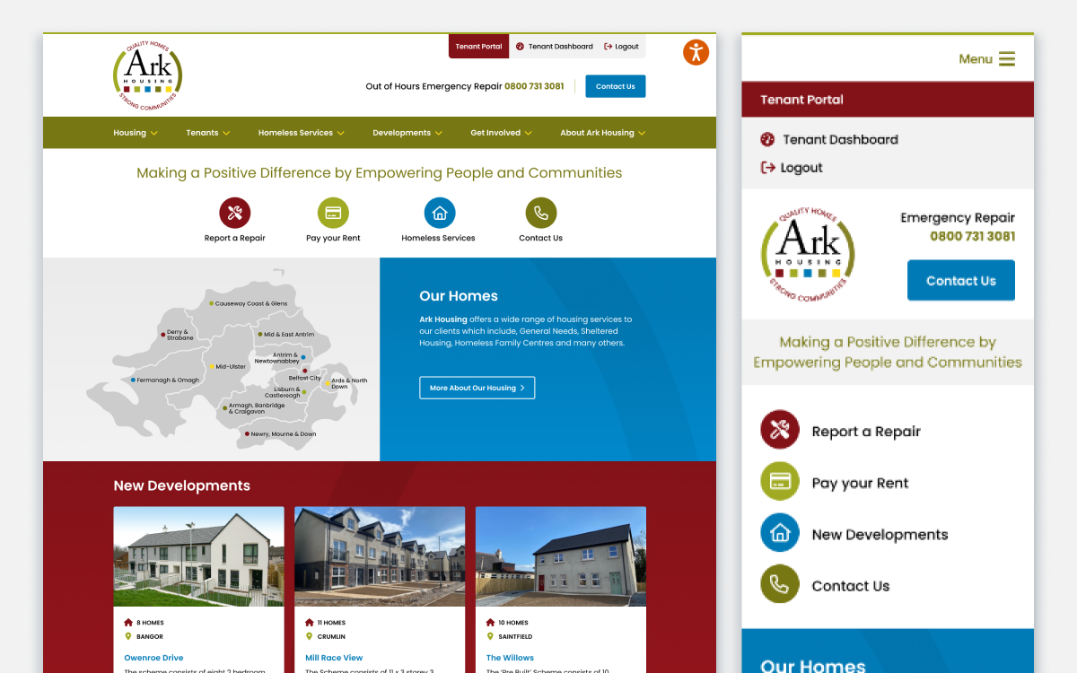
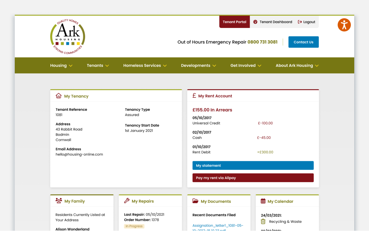
Portal Integration: We then apply the new branding to the My Home portal by designing a custom template. When moving from the website to the portal, the visual experience for both staff and customers is seamless and consistent. Staff have a single login for managing both the website and the portal for a seamless experience.
As well as the work on the design of the website, our team pays a lot of care and attention to the process of importing and uploading content into the new site. Kat, our Support Lead and Developer spends many hours meticulously working with the customer to make sure that everything on the new website looks right and works right. After all, what use is a well-designed, accessible website if the content isn’t there to support it?
The site and portal went live in May, but are Ark happy with the end results? Let’s leave the final word to Laura:
" We are delighted with the output, our website looks modern, fresh and easy to use…everything that we asked for! The design of the site is brilliant. The Housing Online team have also made the admin of the system very easy to use, so we are able to go in and quickly make updates and changes. A huge thank you to everyone at Housing Online, you have been a pleasure to work with. Thank you for your flexibility and patience throughout the project."
You can see the results of all this work on the brand new Ark website.
Good design is an investment, but it should also be an imperative. Building your website to ensure that it is fully accessible to all users may take a little extra time and attention, but it really should be the minimum requirement.
If you want to see what good design could do for your site, why not drop us a line? info@housing-online.com
About Housing Online
Housing Online design and build digital solutions for Housing Associations across the UK and beyond. Our My Home Tenant Portal is live in 30 organisations across Scotland, Northern Ireland and England, many with fully integrated websites designed and developed by our team. In April 2021, in collaboration with seven Scottish Housing Associations, we successfully launched These Homes, a Choice Based Lettings web solution.